Denver Zoo ticket express


Upon analyzing the process of getting tickets to the Denver Zoo, I found that the process was arduous and tedious. As such, I took it upon myself to streamline the process and make this process many times quicker.
Role: I was the lead designer and researcher for the project under the tutelage of Brittney Urich VanHorssen
Challenge: The hope was to speed up the process of checking out as well as making the site look better than it did. I made good attempts in keeping as much website functionality as needed while scraping what felt unnecessary
Research
Current experience of user testing

One significant issue that surfaced pertained to the excessive steps involved in purchasing tickets through the Denver Zoo's website. For most visitors, the primary aim is to swiftly acquire tickets. However, this procedure proves oddly cumbersome, laden with unnecessary tabs. The platform lacks user-friendliness in locating the ticket purchase section, and even upon discovery, the process sprawls across approximately 15 pages before obtaining the tickets.
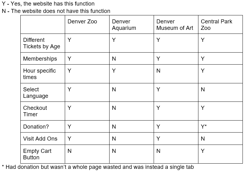
Competitive analysis
How might we statements:
1) How might we streamline this process and get customers checked out in the least amount of time, while still promoting our goods in addition to tickets?
2) How might we clarify times the zoo is open without the need to open another page during this process?
3) How might we clarify access levels of each ticket (why some tickets are more expensive than others not including age differences) in the least amount of required reading?
Problem statement
Customers who wish to purchase tickets, need a quicker and clearer way to purchase, because the current way to buy tickets is long, arduous and confusing
User Flow

As mentioned earlier, we've taken steps to streamline the process significantly. Many pages that were needlessly divided on the existing Denver Zoo website have been consolidated into a single page or eliminated altogether if deemed unnecessary. This overhaul has reduced the page count to 7, effectively halving the number of pages required for navigation.
Low fidelity wireframes

The initial hand-drawn wireframes lay out the basic structure for page modifications. They're rough, missing elements like the date selection and combining billing/checkout pages. I'll add these later, using these sketches as a foundation to build upon and refine further.
Mid fidelity


For the mid-fidelity wireframes, I expanded on the basic layout from the low-fidelity version. I merged checkout pages and repositioned content horizontally for a better visual appeal. However, I missed adding the date selection calendar and overlooked incorporating a login screen. These omissions could raise questions during testing and will be included in the high-fidelity stage. Additionally, feedback highlighted an issue with excessive boxing, which made the design feel too rigid—a point I'll address in the next iteration.
High Fidelity
See prototype here


In the high-fidelity wireframes, I resolved earlier issues by adding polish and addressing pain points. I included the previously missing elements—the calendar and login page—and removed the rigid box-like structures to create a more open design. During user testing, an interesting point emerged about the placement of the login page. Although instructed not to remove or make the page optional, I positioned it just before the ticket selection step, aligning with the feedback received.
Instructor feedback
In the final design, I successfully addressed the two concerns raised by my instructor. Firstly, I ensured consistent spacing throughout the interface for a more cohesive look and improved user experience. Secondly, I adjusted the colors to comply with AA standards for better accessibility. These fixes were implemented effectively, resulting in a polished and compliant final design.
User testing

The high-fidelity wireframe testing received positive feedback from both users, who appreciated the enhancements and streamlining in my personal design. However, the users pointed out the login's location as the primary area of concern during the test.
Updates
I maintained the original placement of the login page intentionally. My belief is that users are more inclined to create an account when given the option before selecting their tickets. Placing the login right before checkout might discourage account creation as users would likely prioritize completing their transaction.
Future plans
I'm considering pitching this design to the Denver Zoo, aiming to both implement it and potentially work on the programming side. It's not only a chance to expand my portfolio but also an opportunity to enhance the experience for many users!
Conclusion
If I were to redo this project, I'd introduce component pieces early in the wireframing process to save time. Prioritizing spacing in the initial design stages would have been beneficial too. However, I'm content with the project's outcome and see it as a valuable learning experience in mastering the basics of Figma.

